Mecca Gets A Makeover

The folks over at Rank have been busy lately working on a brand new redesign of their Mecca Bingo website.
At the moment the old site is still live, but there is a pop-up asking players to give the new site design a try, with the option to go back to the old style for a limited time. I quite like it when sites do this because it means I can look at both versions at the same time and compare any interesting changes or improvements.
Evolution, Not Revolution
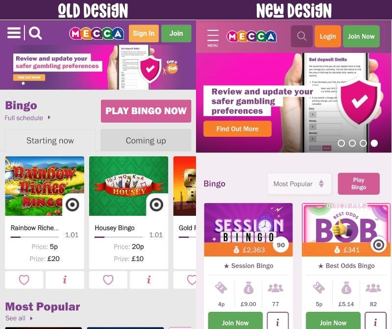
Overall I would say the new Mecca Bingo website is more of an evolution from the old site rather than a major overhaul. Most of the pages and features are in the same or similar locations, but everything has been given an extra bit of polish, with lots of small details that add little improvements.
The biggest change of all is with the main navigation, which has been simplified and reduced in size. It is now much easier for players to find the areas of the site they want to get to, and a prominent ‘Live Help’ button has been added which is a welcome addition.
The new nav looks much better on mobile too, and the sliders which appear at the top of each page are now bigger to account for the mobile screen you are using. Previously they were the same dimensions as the desktop site which meant on mobile they were very small and difficult to read.

Original Mecca design (left) and the new Mecca (right)
The only thing I think doesn’t work with the new design is the use of ‘Join Now’ buttons on the bingo rooms. This is the same ‘Join Now’ button which is used in the top right and is obviously for new players looking to join the site. In my opinion they would be better off rewording these buttons to something different, such as Play Now or Join Room.
Mecca Redesign Reaction Video
If you’re interested in seeing how the new site differs from the old one, check out my reaction video where I breakdown some of the main changes in the new Mecca website.
After putting this video out there I had some great reactions from staff at Mecca, including Head of Commercial Performance Anthony Conroy who agreed with my assumptions about the design choices:
“You were absolutely spot on in terms of the intention to make this a real evolution to keep much of the site familiar but add in helpful elements to enhance the player experience. It’s been a long road and a lot of hard work but we’re happy with the current version. More to do though so keep an eye in the coming weeks for some further features.” – Anthony Conroy, Mecca Bingo.
I also have since learned that Rank teamed up with Lancashire-based Tone Agency who worked on the UX (user experience) design for the new site. Tone do a lot of work with Mecca which you can see on their Mecca showcase page.


